Planning
Good research into similar texts. No research into audience, and no analysis of findings. Some drafts.
12/20
Construction
Proficient use of software to construct pages. Good manipulation of images and text. A bit too much white space on contents page and it feels a little huddled together in the centre of the page. Excellent front cover
53/60
Evaluation
Some attempt to address the seven set questions. Some attempt at critical analysis. Not really enough detail or analysis.
12/20
Overall
77/100 Grade B
Sunday, October 18, 2009
Sunday, October 11, 2009
Evaluation
Both my front cover and contents follow the main media conventions. The main difference is that for my front cover, vision is focused on the image rather than the mast head or cover lines. For the contents there is less emphasis on the images, it’s focus is for an uncomplicated and easy to read contents.
My product is mainly focused at students. With use of the very bright and colourful front cover it grabs the attention of the reader. It also presents the message that every student can control the school and his school life.
A school. My magazine would promote learning and encourage knowledge for the reader. And would also provide information on the school in question and why it is a great one.
having previously learnt Photoshop on pc, so using on a Mac was basically re-learning the whole program again thus diversifying my media capabilities, although I still prefer windows over snow leopard. I have also learnt a completely new program; Indesign, it is a lot better at making general magazine pages than Photoshop of Microsoft publisher, although simple image manipulation can be a pain.


Production of the Contents page
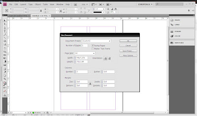
I made my contents with the use of Adobe Indesign.
 First I inserted the text; the header and the body. Editing the size and colour. I chose to make each section a different colour to separate them.
 I then inserted some images, changing there dimensions isn’t as easy as dragging a corner. The best way is shown below but you can make the image fit the box exactly.

Production of the Font Cover
To make my front cover I used Adobe Photoshop.
With the ideas from my draft in my head I started by taking some photos of my good friend Samuel L Whitlow. I made sure that all where taken in medium close up and on a white background cutting easier.
Once I had chosen my image I proceeded to cut it out with the magnetic lasso tool.
 After Whitlow was nicely cut out, I made a background that was both eye catching and empowering. This background is made up of triangles centred about his hands.
 The next step was to place our school in his hands. I did this by first cutting and placing an image of a model of our school on the cover.
Then cut around and copied whitlow’s hands onto another layer in front.

To make the school sit better I had to skew it slightly.
I then added and edited the mast head via blending options. I added a drop shadow and an emboss to make it more interesting

I did the same for the cover line as well. Which I chose to do in a less formal font.
With the ideas from my draft in my head I started by taking some photos of my good friend Samuel L Whitlow. I made sure that all where taken in medium close up and on a white background cutting easier.
Once I had chosen my image I proceeded to cut it out with the magnetic lasso tool.
 After Whitlow was nicely cut out, I made a background that was both eye catching and empowering. This background is made up of triangles centred about his hands.
 The next step was to place our school in his hands. I did this by first cutting and placing an image of a model of our school on the cover.

I then added and edited the mast head via blending options. I added a drop shadow and an emboss to make it more interesting


This is my main inspiration for my contents page. It is an extremely simplistic design with each subsection of the magazine mapped out to a different colour. This relates well to our school as each house within the school has its own colour.
This also follows all the main codes and conventions of a contents page.
PLANNING THE PRELIMINARY TASK
First I drew out some very simplistic preliminary designs for both the front cover and the contents page.

^Front cover^

^Contents page^
These where just two of many ideas and where the ones I ended up using for the final product.

^Front cover^

^Contents page^
These where just two of many ideas and where the ones I ended up using for the final product.
Tuesday, September 15, 2009

Develop is a games developer’s magazine. This magazine is mainly aimed at aspiring developers, age range 17-30. The front cover features a well known and very creative game, this will appeal to their audience as most up and coming games developers would love to be on the media molecule team.
There is a lot of text on this cover; aligned right of the main image and under both the mast head and the main image. The mast head is separate from the image. Also develop includes advertising on it’s cover, this is rare as advertising on front usually means advertising inside.
Monday, September 14, 2009

Jersey Gallery magazine is a free print and is aimed at a verity of people; it’s mainly a fashion magazine aimed towards fairer sex, but there are also many articles aimed at teenage boys which follow a more comedic style. Gallery magazine is aimed at
Gallery uses a graphical image as the need to relate isn’t a primary concern due to it being an already well established independent magazine.
This cover is extremely simplistic the sub text blends into the main image and the masthead is separate from the picture. There is some small text at the top of the print, stating the issue number and date of release
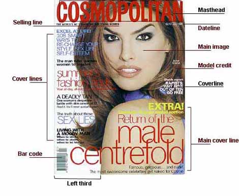
This image portrays all of the main codes and conventions of a magazine front cover. It lists all the main requirements of a cover, although all do not need to be met, as my other examples show. The most important parts of the cover are; the mast head, cover line and the main image and there position on the page.
Subscribe to:
Comments (Atom)